How to Style a Picture Ledge with Vintage Art
photo by Hado Photo
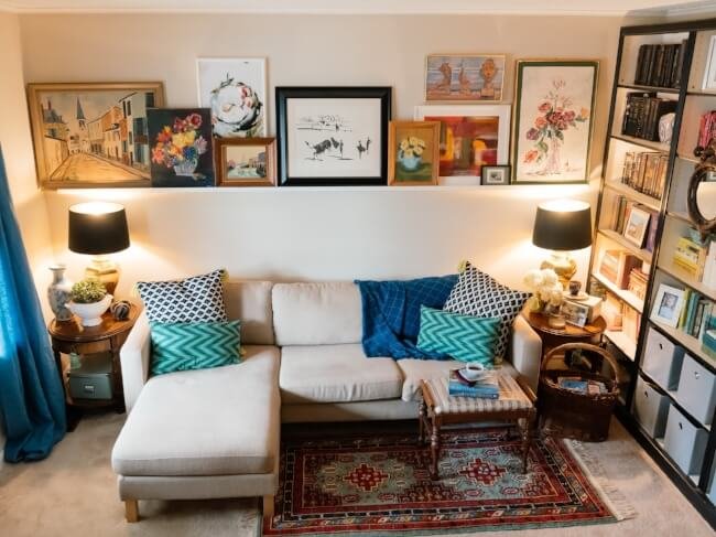
This wall in my living room, ya'll. It changes more than I do outfits. I am constantly rearranging depending on my latest art finds. (Did you see my Instagram post yesterday? It has already changed from this picture taken 2 weeks ago).
As I have mentioned before, we live in a rental. Much to my frustration, my landlord will not let me paint and don't even get me started on how horrible that carpet is. Adding fun and bright art is such an easy way for me to take this drab room up a notch.
This wall was once a gallery wall. (Forgive the horrible quality of the picture - this is from my iphone from a million years ago. )
But, I was rearranging it so often, I went ahead and installed the picture ledge. I like that I can make it look clean or busy in about 10 minutes with a simple rearranging of the art.
Styling the “Overstuffed and Messy Look”
Layer
If you like that overstuffed look (like I do) layer the images. Start with your biggest ones and put them in the back. I like to flank images in 3's. So I added my biggest images to the middle and the ends.
Then start adding a second layer to fill in the empty spaces between your first layer.
Again, add another layer to fill in the empty spaces. Start overlapping here. This is where the shelf will start having some depth.
Don't be afraid to hang a few too if there are holes. Or if you are covering too much of an image, hang it. The white picture on the left hand side is actually hung on the wall.
Color and Style of Images
If you are trying to make it look messy and overstuffed, pay attention to where and how you place the images. For instance, I did the black and white in the middle since it was the only one I had of that kind. I tried to make sure the floral prints were not next to each other or make sure the abstract image in the white frame was not next to the red/multicolor print in the white frame. I didn't want the two white framed abstracts next to each other.
Other Picture Ledge Ideas
Not into the overstuffed look? Here are some other ideas that I also love.
Add other objects to the picture ledge
I love everything about these pictures (gahhh, that couch, I have such a crush right now on mustard velvet fabrics). But I love the way they used this ledge to add other objects. Notice the way they mix colors and textures...wood rough candlestick with the smooth wood clock and the smooth blue vase.
Incorporate the picture ledge into wall with other objects
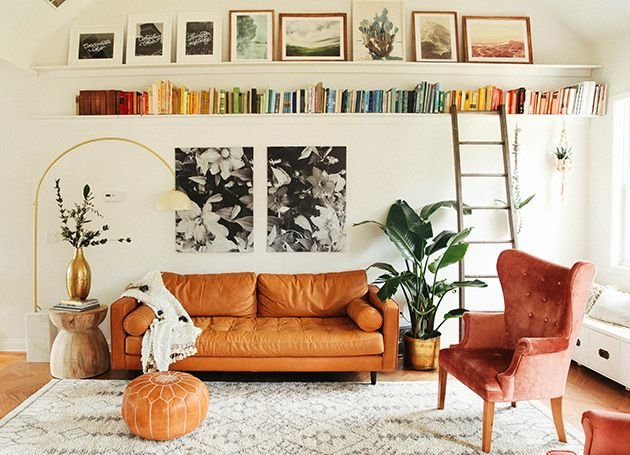
I adore the way they added the color coded books under the picture ledge. The pictures are muted and help add height to the room.
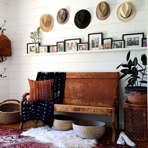
Below they kept the images in similar frames and added muted hats. This adds a lot of character to the wall and the images really shine in the harmonious black frames.
Create a timeless and classic look
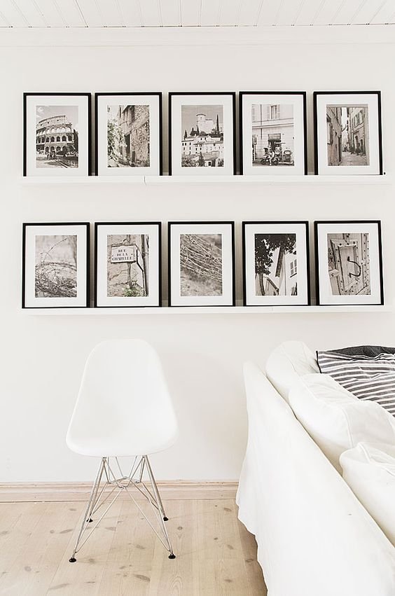
Not sure how to do any of this or unsure where to start? Look how beautiful this is. They are all the same. Same types of prints (landscapes and no portraits of people) and same frames/matts. They are all the same size. It adds peace to the space.
What type of picture ledge are you most drawn? Do you have tips that you use to help style them?


